CLIENT
Cobranza AI
WORK
Web Design
INDUSTY
SaaS
AI
Paytech
Cobranza AI approached us looking for a strategic design partner to transform their outdated website into a high-converting asset.
Their previous site failed to communicate their value proposition and didn’t reflect the professionalism or innovation of their brand and time was limited.
They needed a website that not only stood out but positioned them above their competitors.
After a brief discovery call and alignment on goals, they chose to move forward with us for the design phase. We collaborated closely with their internal development team to bring the new site to life faster, sharper, and more aligned with their growth.

CHALLENGE
Cobranza AI had a clear vision for their new website and a tight timeline to match.
To meet their expectations, we needed to rethink and redesign several core aspects:

Site structure
The previous layout lacked hierarchy and clarity, making it difficult for users to navigate or understand what the company offered.
Value proposition
Their messaging was too broad and didn’t speak directly to their ideal client.
Visual identity
The original visuals felt generic and disconnected from their brand personality.

Our Process
We kicked things off with a short, focused call where they shared their initial ideas and existing assets.
To streamline the process and stay aligned, we followed up with a discovery form designed to capture the key insights we needed without slowing things down.
From there, we made small but impactful tweaks to their brand tones, ensuring they resonated more strongly with their target audience and industry.
With that foundation, we mapped out a new site structure clear, conversion-oriented, and shaped by both their input and our strategic guidance.
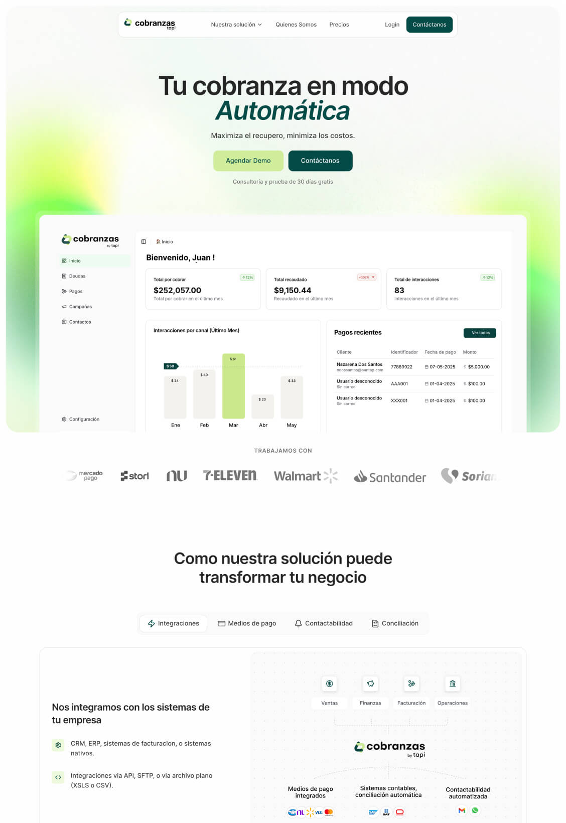
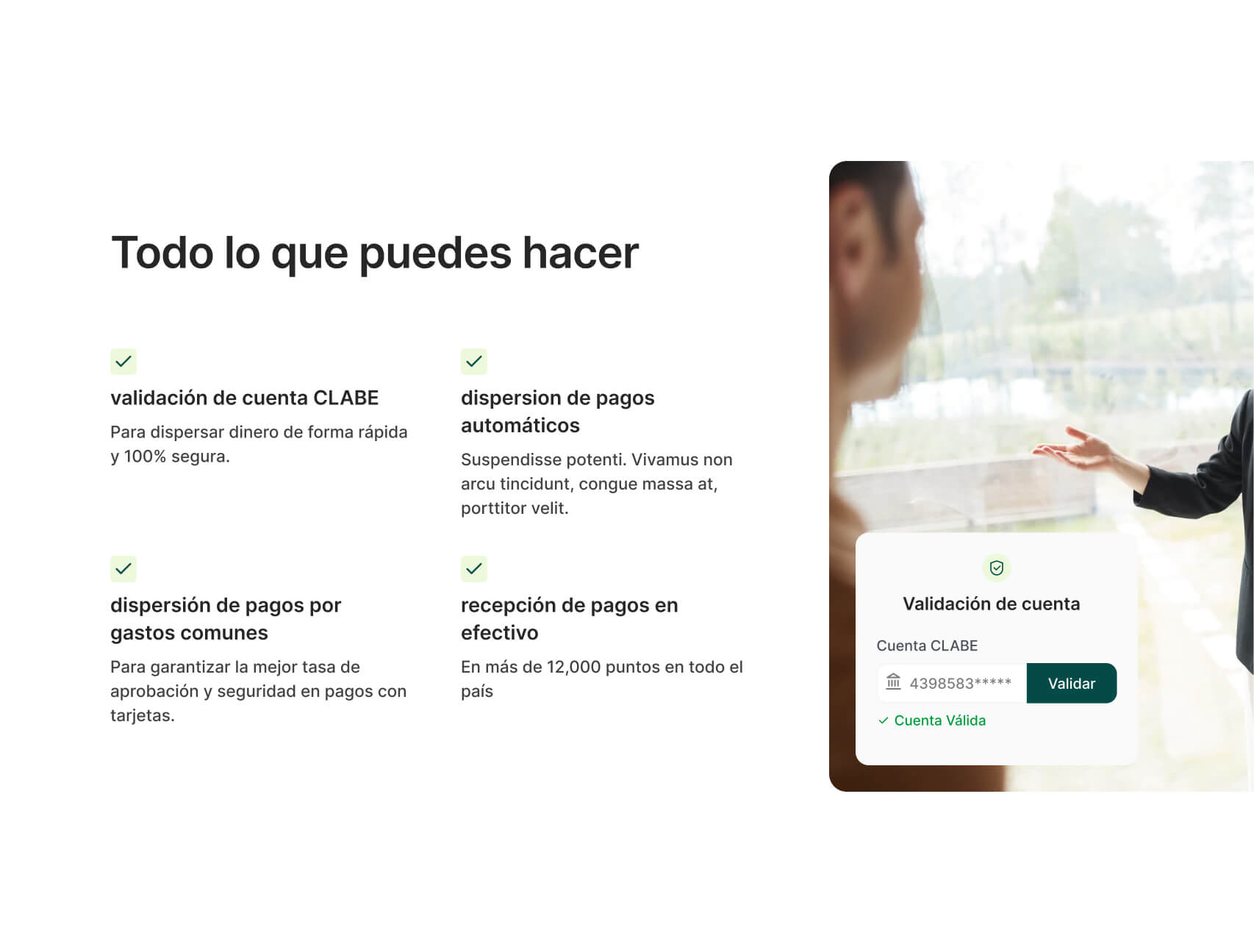
The first design draft brought it all together: a clean, modern layout where their value proposition stood out clearly and the content was visually easy to digest.
Their first feedback?

Despite tight deadlines, we met every deadline giving their developers exactly what they needed to implement the new site smoothly and on time.

What We Did
To bring the new vision to life, we implemented a series of strategic enhancements aimed at improving the user experience, establishing trust from the first interaction, and elevating the brand’s digital presence with a more refined, professional look.
Here’s what we delivered:

Full website design
A complete redesign of every key page, focusing on clarity, flow, and conversion. The layout was crafted to guide users naturally through the site, making it easier to understand what Cobranza AI offers and why it matters.
Visual support and direction
We developed a consistent visual language that supported the messaging and reinforced the brand’s credibility. This included iconography, imagery guidelines, and visual hierarchy to ensure every element had purpose.
Updated brand color tones
We fine-tuned their color palette to better reflect their niche. Introducing tones that felt more modern, trustworthy, and aligned with the fintech space.
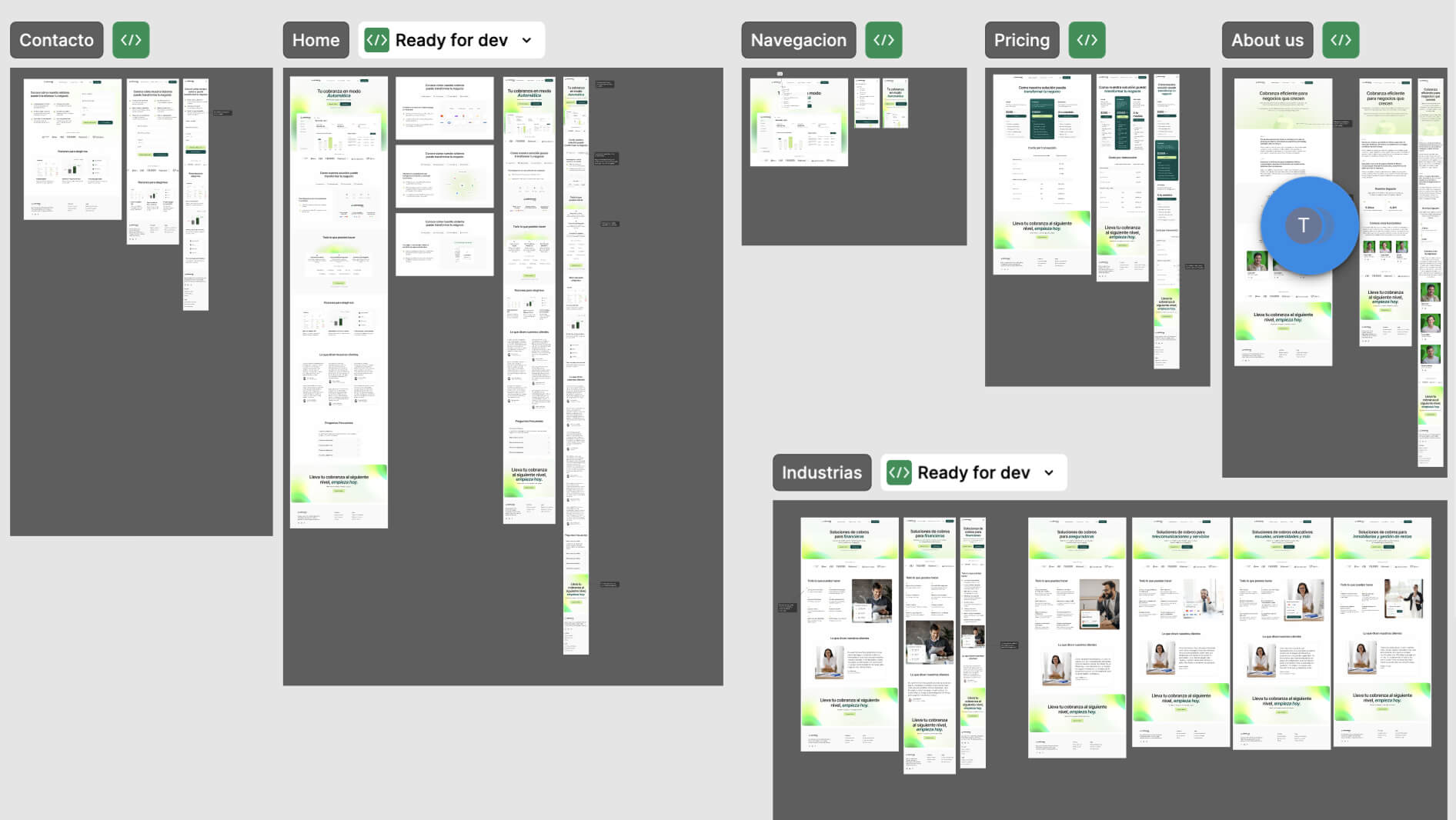
Organized Figma file for smooth previews and asset export
The final designs were delivered in a well-structured Figma file, making it easy for their internal team to review, extract assets, and implement the design without confusion or delays.
Ongoing support for their development team during implementation
Throughout implementation, we stayed closely connected with their dev team providing clarifications, design assets, and support to ensure the final result matched the original vision down to the last detail.


The Result
Cobranza AI’s previous website didn’t do their product justice, lacked a clear message and didn’t communicate the value of their solution. As a result, it was holding back their ability to grow and stand out in a competitive market.
With the new site, that changed completely.
From the first review, the redesign exceeded expectations. They now have a digital presence that clearly communicates their value, elevates their brand perception, and gives them a solid foundation to scale with confidence.